First row: For the first row we had to find a picture with a dpi of 1200. To change the resolution size of each picture we had to go into image, then image size and change the resolution to either 1200, 600, 300 or 72 dpi while changing the height to one. You can change the height in the same box that you change the resolution in. As you can see, starting with the picture on the left, the higher the dpi the clearer the picture will appear.
Second row: We first had to find a picture on the web with a dpi higher than 72. We changed the image to be 1 inch tall and then dragged the picture into the color RGB box on the sheet. Next, we then took the original picture and changed it to CMYK by going into image and selecting mode and changing it CMYK. For the next picture we wanted it to be black and white so we had to change it to black and white in the mode tab. To change it to duotone we had to change the picture back to gray scale and then click duotone.
Third row: First, we found a landscape picture that was also higher then 72 dpi. It didn’t have to be but the picture would look better if it was. Nothing had to be done to that picture so we put that one on the contact sheet. We then took the original picture and clicked the crop tool. While on the crop tool we had to change the height and width to 1 x 1 so when cropped it made a perfect square. To get a portrait sized picture we went back to the original again and when clicked on the crop tool you had to make sure the height was more than the width.
Fourth row: For this row we found a picture and then saved it. We used the original picture and changed the image height to 1, which made the width size change. When we clicked on the crop tool we had to make sure that the height was 1 and the width was whatever it had changed to when we first changed the height in the image size. This was so whatever we cropped it would stay the same size. We repeated the same steps not using the original image but the last picture we edited. The end picture should have been a close up of an object from the original.
Fifth row: We first had to find a representation picture and something with content. For this row, we followed a similar process to the row before. We took a picture and saved it and then with that picture we changed the height to 1 in the image size. Then when we went to crop we made sure the height was 1 and the width was the same width as when it changed in the image size. We cropped it the same way as row four where we kept going back to the previous image but the end image was supposed to look abstract.
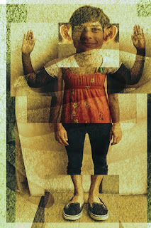
Sixth row: We found any image we wanted and saved it on the contact sheet. We could choose any style filter we wanted and I chose poster edges, dark strokes, palette knife because I thought those looked really neat with the picture I chose.


